Prototyping an online development guide for medical devices

At my last blog post, I have told you that it was not possible to launch the development guide for medical devices from the beginning of our online platform medizintechnologie.de. This blog post describes the design and prototyping process of our development guide for medical device engineers.
User needs and requirement
The user research and the medical device development literature revealed the demand for a fast overview, how a medical device has to be developed in Germany/Europe. Furthermore, a good decision making in that industry is more important than in other industry. For instance, in certain cases a clinical study has to be executed for receiving the EU certification. In that context it makes also sense to prove the study design, if it meets the requirements of a clinical study defined by the health insurances in Germany. This circumstance is very important that the medical device and its therapy get accepted by the public health insurance system. If the clinical does not fulfill those requirements, then a second clinical study has to be executed, which can cause a big amount of costs and a significant delay in development of a medical product. Therefore, our guide has to present those dependencies within the development processes very clearly. Another specific characteristic of medical engineering are the diversity of medical technology and products. It is obvious that our guide cannot give detailed information for every specific technology in the medical engineering field. For detailed information, the medical engineers have to contact experts, consultants and so on, which they can find on our databases. Nevertheless, we want also to provide our users the opportunity to individualize our service and content. The objective is that our users get enough information for contacting the appropriate experts in those specific fields and be able to ask the right questions. In such manner, the medical technology industry in Germany is already forced with an overload of widely distributed information. Our guide plans to reduce the information with special filter functions and fast linkages to the relevant information sources. Of course, the usage of our online guide should be entertaining and engage exploration of the medical engineering field.
The core of our Information Architectur
Our main objective was to fulfill all of the above mentioned requirements, which was for all of us more than a huge challenge. We have not found any literature or software tool, which deals with the complete complexity of a development process of a medical device. Related to the high level complexity, we decided to split our guide in three categories to reduce that complexity.
- Overview Layer (for Introduction and exploration of medical product development)
- Expert Layer (more detailed information about a specific topic and its dependencies)
- Cockpit (Simulation tools, specific filter function for individualizing the guiding tool)
This basic structure enabled us to implement our online guide step by step. That also made the process of designing a roadmap much easier and enabled us to develop clear business decisions.
Iteration No. 1: Ideation and Orientation
With our first round of requirements and the development of our first core information architecture, we were able to start the ideation phase through prototypes. Those prototypes should help us to get a feeling in which direction our online/web-based guide should evolve. For me, as the Prototype developer, it was very important to show two or three different version, which distinguishes each other strongly in the look and feel. In that context, I have adapted and applied the design processes by Bill Buxton described in the book “Sketching User Experiences.”
One of the three versions was an interactive websites with various forms, which added, removed or filtered content. The second version was a very graph-based version, which was strongly based on the Business Process Model and Notation (BPMN) Language. The third version holds some similarities with the first version, but had a focus on a project based tooling.
The feedback from our interdisciplinary team was very helpful and diverse. In the end, we decided the content must be more reduced for the “Overview layer”. We need a graphical or a map based navigation interface for our “Overview layer”, which delivers orientation and an engaging exploration for the user (but the BPMN is too detailed for that). The smallest content unit will be based on business/development processes and not on results. Our copywriters made a very useful suggestion to describe each process with the German-based approach “journalistische W-Fragen” (What to do, who is involved, how to do it, for what is it needed, what take care of, etc.). With these new findings, we could continue to the second iteration.
Iteration No.2: Hierarchical content structure and content production
During the second iteration we dealt with developing a hierarchical content structure. After we produced and structured all the processes, we began with the validation of our content. For this we traveled through Germany and interviewed medical product experts from small to very big medical corporates. During those intense interviews, we gathered some additional user needs and feedback for our online guide. Packed with the conscious that we have to apply some bigger changes, we traveled home and started editing our content from a chronicle order to a more hierarchical network based business process order. It took us some time to get the content structure fixed, but more importantly, we solved that challenge and ended up creating a useful content structure (which was still within the limit of 7+/-2 for good navigation usability and the reduction of cognitive load).
Iteration No.3: Navigational interface for the “Overview Layer”
Beside the challenge of content production, we also had to challenge against a fast, flexible and engaging visualization concept for our “Overview Layer”. That visualization was supposed to be interactive and had to take over the navigation of our online guide. Based on the gathered feedback and requirements from our medical device expert interviews, some signs directed us to a network, cluster or map based approach. A web based research on network and cluster visualizations delivered more or less unsatisfying results for our application. A literature research with focus on thematic cartography and hierarchy & weaked link data was more helpful as you could see below.
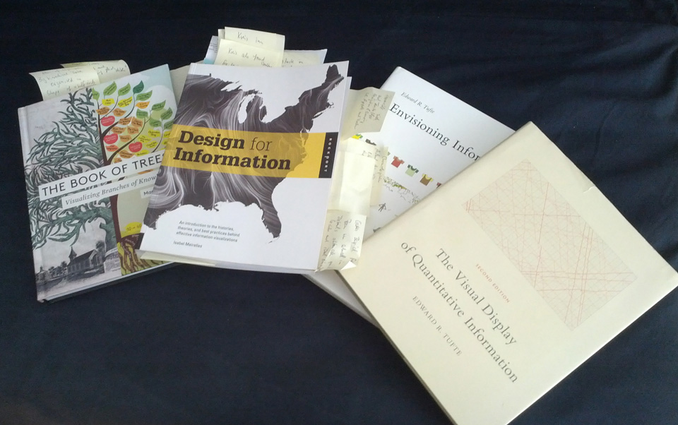
Sources of my literature research
Literature copies for paper prototyping
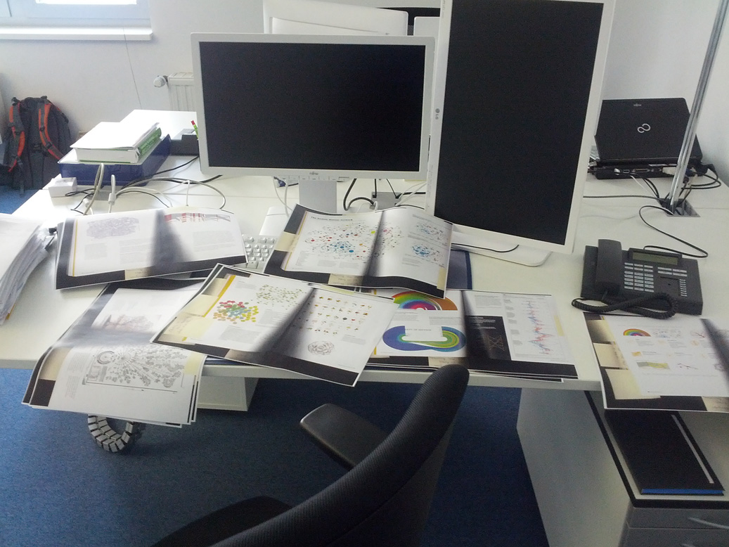
Inspired by the books - Design for Information, Envisioning Information, The book of Trees, Map Mania, and The Visual Display of Quantitative Information - I started tinkering around physically with our content structure (classical Paper Prototyping approach adapted on Info Vis). If you ask me why physically?! Because the haptic interaction enables me some more freedom of expression, like the cognitive load is lower for me than tinkering around digitally. Furthermore, my coworker can join my tinker session without any problems and give direct feedback through direct manipulation.
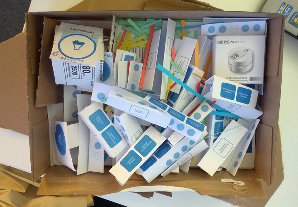
Paper Prototyping Box
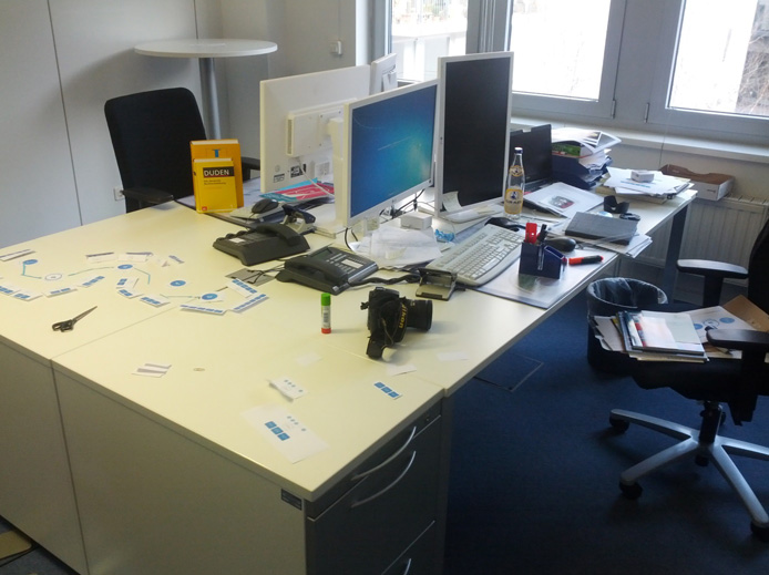
Play Environment
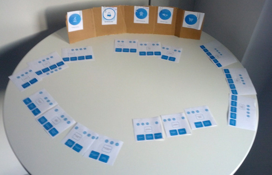
Start Circle Layout
Tinkering around
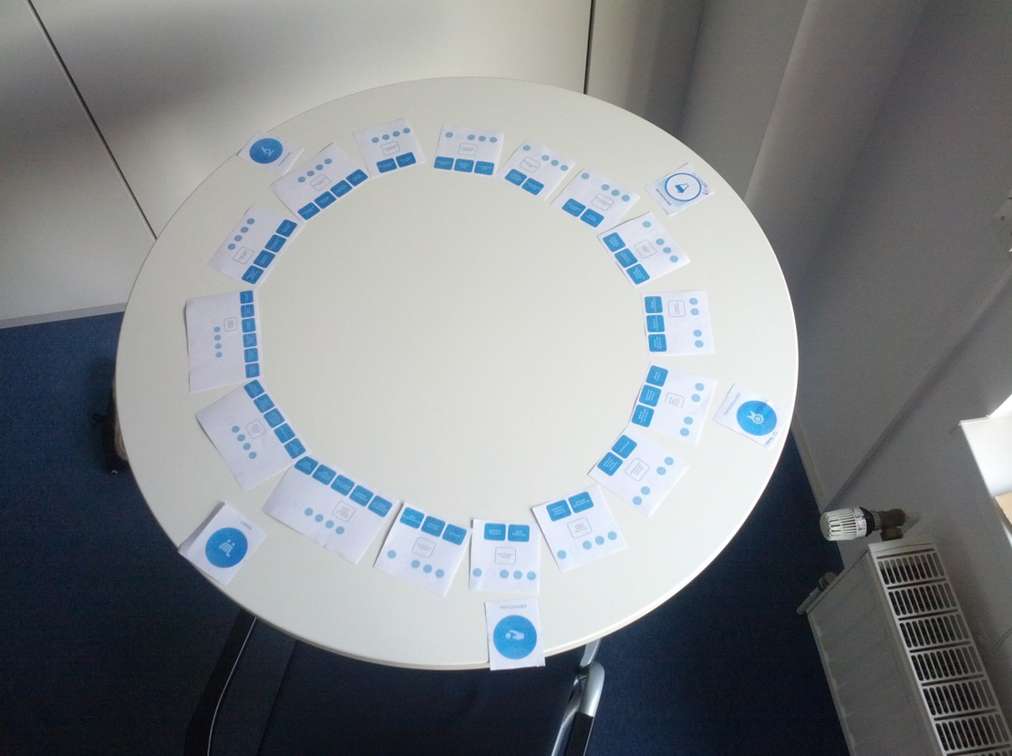
After each satisfying arrangement, I took a photo of it and documented it. A short review of my experimentations gave me some confident that I was on the right way. More awkwardly, a few nights later, I dreamt very detailed about a complete working version of our online guide. Very early in the morning, I woke up and started scribbling down everything from my mind for a few hours. The results were those wireframes with annotations (so that I could not forget anything from my weird miracle vision).
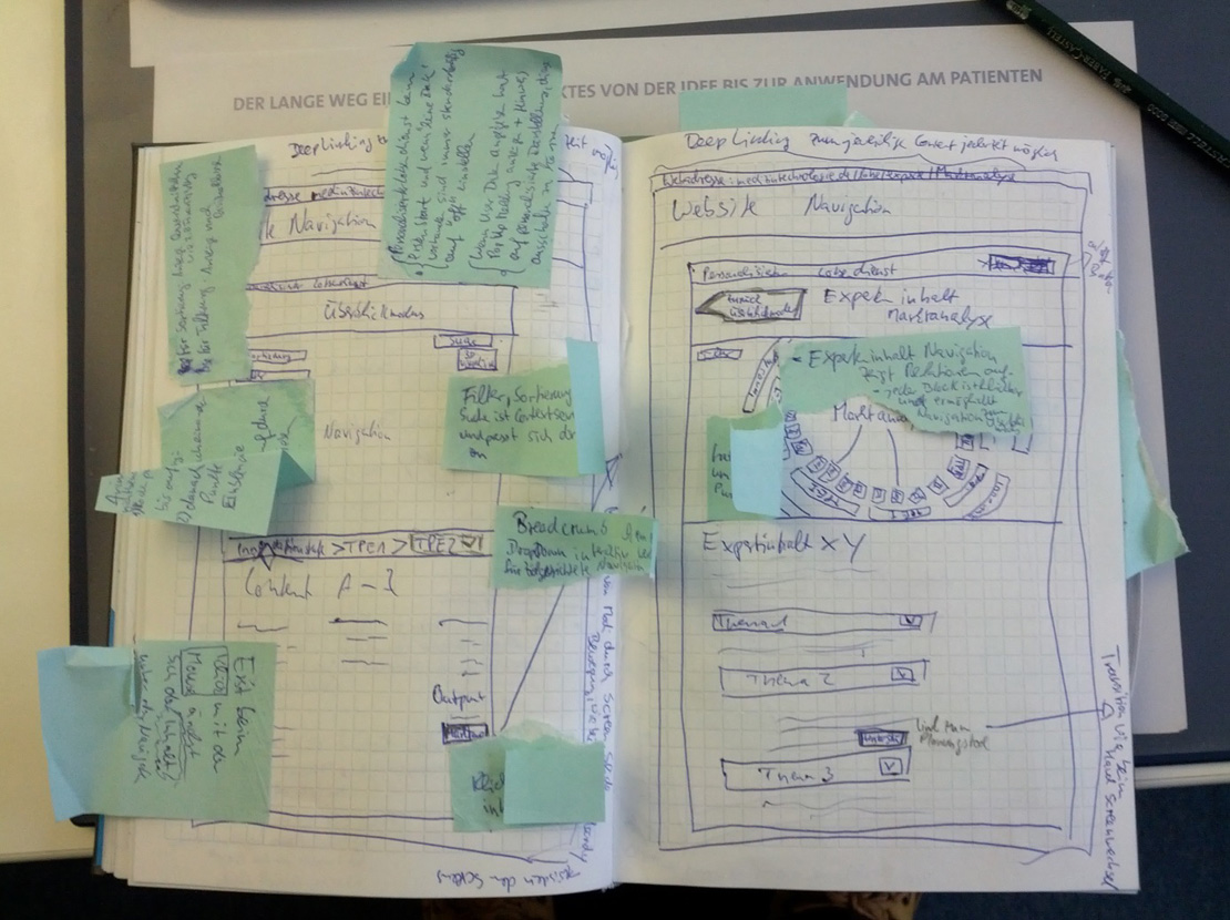
Wireframe sketch #1 for online guide
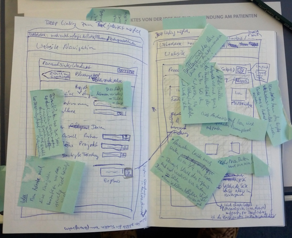
Wireframe sketch #2 for online guide
A long breakfast later, I started testing my scribbles with a paper prototype approach. Surprisingly, my concept was consistent and worked out. So I started to develop a low-to-mid-fidelity prototype based on my wireframes. The result was clickable prototype with a navigation, links + content container for the expert layer, and even the cockpit for individualize our online guide on specific medical product characteristics.
With this prototype we went to your intern management, to our partners and finally to our client. The feedback was overall very positive and we got the go for that direction.
Implantation fort the next milestone
Due a next milestone presentation, we decided to launch only the “Overview Layer” and use our findings from the prototype for the next product launch. The final version had some reduction of the visualization and navigation interface. Together with our Internet agency, we decided to take the more conservative approach, so that we can be sure our website works also on older Internet Explorers (unfortunately some big corporates still use old fashion browser). The final versions looked like this:

Overview Layer Startscreen
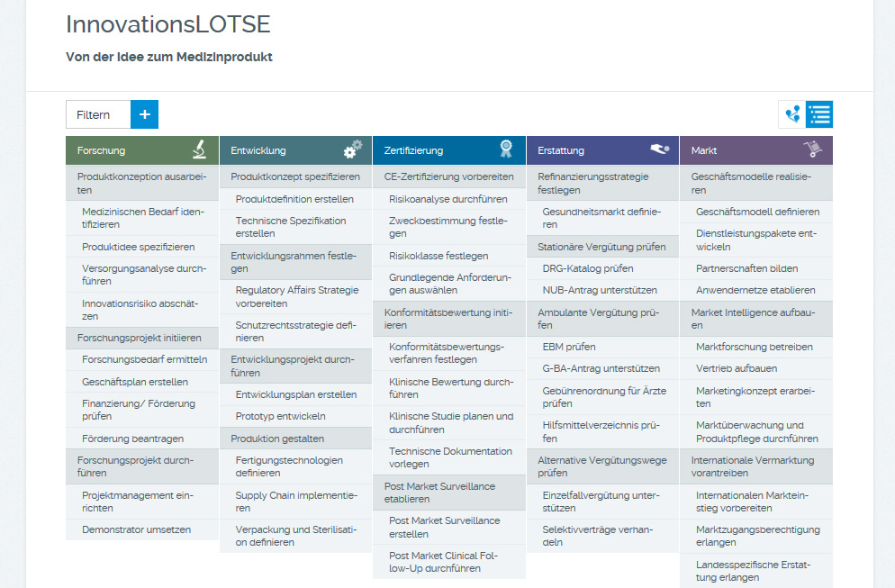
Overview Layer in list view mode

Navigation tree with active node
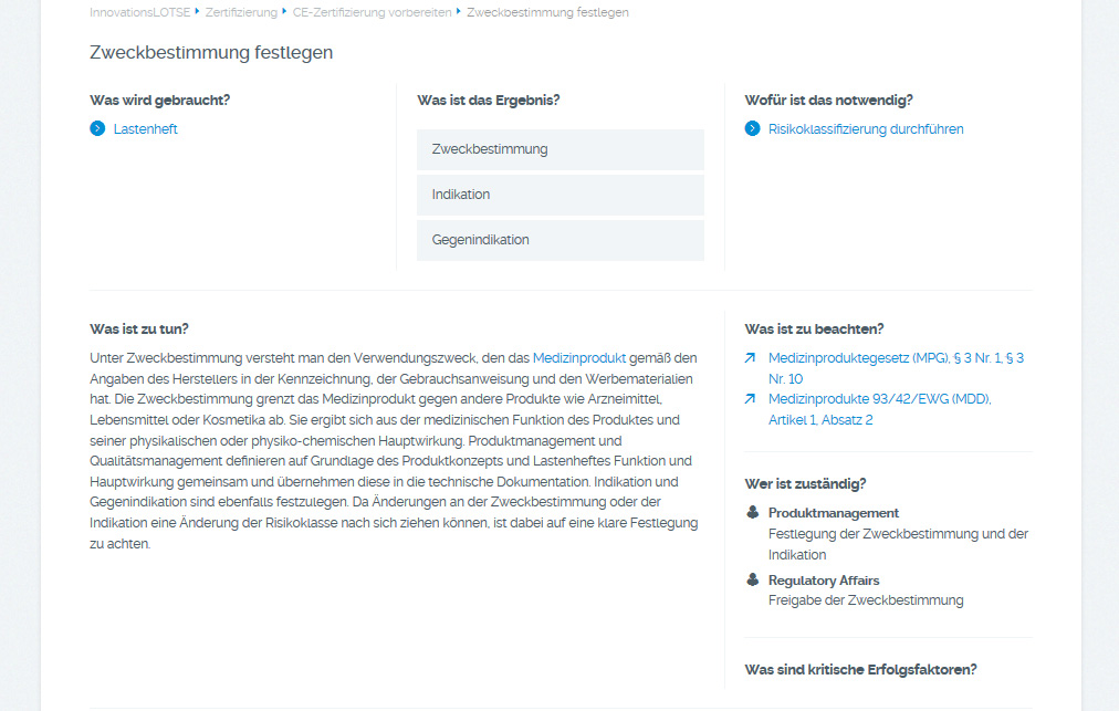
Content structure of a development process
Please check and visit our online guide in action -> InnovationsLOTSE
References:
Buxton, Bill (2007). Sketching User Experiences: Getting the Design Right and the Right Design (Interactive Technologies). Morgan Kaufmann, 2007.
Krug, Steve (2005). Don't Make Me Think: A Common Sense Approach to Web Usability. New Riders; 2nd edition; 2005.
Meirelles, Isabel (2013). Design for Information. Rockport Publishers, 2013.
Tufte, Edward R. (1990). Envisioning Information. Graphics Press, 1990.
Tufte, Edward R. (2001). Visual Display of Quantitative Information. Bertrams, 2001.
Lima, Manuel (2014). The Book of Trees: Visualizing Branches of Knowledge. Abrams Books, 2014.
PIE International (2015). Map Mania - Design of Map for Designers (Japanese Edition). PIE Books, 2015.
Miller, George A. (1994). The magical number seven, plus or minus two: Some limits on our capacity for processing information. Psychological Review, Vol 101(2), Apr 1994, 343-352. http://dx.doi.org/10.1037/0033-295X.101.2.343
Reinhard Sefelin, Manfred Tscheligi, and Verena Giller (2003). Paper prototyping - what is it good for?: a comparison of paper- and computer-based low-fidelity prototyping. In CHI '03 Extended Abstracts on Human Factors in Computing Systems (CHI EA '03). ACM, New York, NY, USA, 778-779. DOI=http://dx.doi.org/10.1145/765891.765986
Halarewich, Danny (2016). Reducing Cognitive Overload For A Better User Experience. Smashing Magazine
Cuello, Javier (2016). Choosing The Right Prototyping Tool. Smashing Magazine
Cerejo, Lyndon (2010). Design Better And Faster With Rapid Prototyping. Smashing Magazine
Busche, Laura (2014). The Skeptic’s Guide To Low-Fidelity Prototyping. Smashing Magazine
Senos, Dustin (2016). How to get value from wireframes. Medium Homepage
Vyhouski, Nick (2016). Everything You Need to Know about UX Sketching. UXness Homepage
Jia, Grace (2016). Need-to-Know Skills of UI Design for Mobile Devices. Mockplus Blog
Nice comparsion of low and high fidelity prototyping
https://www.nngroup.com/articles/ux-prototype-hi-lo-fidelity/