An online platform for medical engineering: Vision, Information and requirement engineering

Some time ago, I posted a ‘making of’ series about the low-budget project wasfuttern.de. This time I will blog about the development process of the current bigger (3-5 years) web project in the field of medical engineering in Germany. My writings intend to give Interaction Designer and User Experience specialist an insight view what I have learnt from this project.
Background
When I started end of 2012, the publication Website: Nationaler Strategieprozess "Innovationen in der Medizintechnik" appeared and stated Germany needs more informational transparency about the medical engineering industry. The medical engineer stakeholders should be better connected to each other. And on-going, start-ups, small and mid-sized businesses need more support during their certification process within EU.
As one solution for these problems an online platform for the medical engineering community in Germany was proposed.
Beginning with my research
At the start of the project, I was motivated, but without any solid knowledge in medical engineering. For this reason I began to research the differences of developing a medical product compared to a consumer (communication) product. My research goals were:
- Figure out how deep, I have to dive into medical engineering to understand my coworkers, partners and of course my boss
- Understand the complexity and basic mechanisms of the industry
- Understand and figure out the important topics and their needs. That means focus on the right problems.
My coworkers and I decided to start investigating one of the most complex topics in medical product development process: the CE certification procedure. In that connection I did a literature research and those two books, which were at the end a great help for me:
During my research, I also revisited my expertise about knowledge management systems. The Community of Knowledge - die Wissensmanagement-Plattform and the lecture „Atlas/Kartographie/Archiv: Zur Sammlung und Darstellung komplexer Sachverhalte“ (2011) by Prof. Dr. Düllo and Prof. Dr. Zielinski at the UDK Berlin were great sources of inspiration for my following visualizations and prototypes.
First round of evaluation the information architecture
After doing a lot of theoretical research on the certification process of medical products in Germany, the time had come to prove my understandings. In agreement with my coworker, I created a paper-based zoom-able flow diagram (very similar to the mindmapping method), which was inspired by RSA Animates and the online presentation tool Prezi. This analog prototype presented a chronicle information architecture (see the alphabetic annotations) based on the certification procedure, that was described and structured in the above mention book ‘Regulatorische Anforderungen an Medizinprodukte’. My paper-based visualization was applied as guidance for our dialogs about the content detail and the crucial processes of certification. Furthermore, the (un)folding interaction technique of content packages exposed us the amount and complexity of content in each process. It was the first time that the team experienced the content in a graspable manner. Please consider that this video underneath represents a sketch for discussions. It does not meet the requirement of a valid presentation of the certification process. Please consider this fact while watching!
The second round reflects user and industry needs
After some weeks, my research on medical products and its industry made me more confident. It was about time to deal with the user needs and goals for our online platform. Luckily, there was organized a special conference about those needs of the industry, before I began to work on this project. Furthermore, me as a webmaster ofthis conference website, had fortunately full access to the protocols, which made my life as a Interaction Designer much more easier. My analysis was committed to the whole medical product development process and finding all detailed formulated user needs. Each step, like e.g. research & development, was assigned to certain criterias (current problem exist, problem solving via platform possible, user wish and need, and new content for the platform), which worked surprisingly well through all protocols. I summarized each step with the involved stakeholders and a list of user needs, that coulde be solved by a website. The formulation of the priority setting have be done with my medical engineer coworkers in workshop environment.
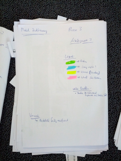
The cover of notes
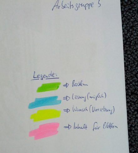
Color codes of marking

paper slices for the workshop
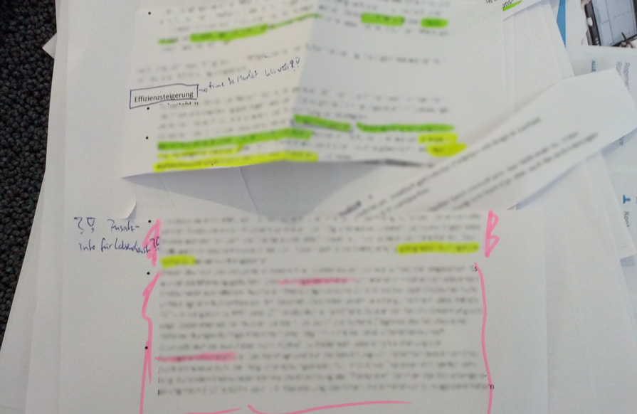
example of an analyzed protocol text
In preparation of this workshop, I cut the most important user needs and problems into paper slices, so that all workshop members could arrange the topics in very tangible way. That analog approach worked out very well, because our workshop member had various experiences with computers. In that specific workshop setting, technology would have excluded some of our attendees, which is in my opinion a really worse case scenario. In the end of the workshop, it was more clear and obvious for our team in which direction the platform has to evolve.
Shaping and building up the initial information architecture
Before I started joining the project, a first part of the online platform was already implemented. This part dealt with editorial information like news and comprehensive article about technology trends. After our feedback workshop, we were confronted with more complex requirements than a news platform can offer. We had to handle various kinds of digital data on a time-based dimension, different level of complexity within a topic, and amount of data. In that connection we decided to implement a three-pronged approach:
- A short to mid-term content layer for news and articles about new trends of the field
- Databases: Event calendar and a database for connecting institutional players
- A long-term content layer in shape of online guide for medical product development
Our big challenge was to connect all this different content and knowledge together. We established this unified connection between each content item (article, institutional players, events, etc.) through our own customized tagging framework. Due the multidisciplinary characteristic of medical engineering, it is impossible to define a classification system on medical disciplines, kind of services, kinds of products or so on.
For this reason, we decided to assign predefined tags for the industry relevant topics. The filter system of our player database provides a nice insight of our collection of predefined tags. The amount of tags is not static. Our tagging framework allows to group tags and as well as editing tags. After the first couple of months we also recognize that we had run into problem with industry relevant definitions. For instance, the tagging-group “product category” contains the word "telemedicine", which is kinda strong related with "home care" and "ehealth". Another problem were abbreviations and different styles of using technical terms. For instance the word "Magnetic resonance imaging" can be used also as "MRI" or "MRT" or "NMRI". In our case we solved this issue with a new synonym feature in our framework that allows us to gather content in a semantic context, too. That means the content tagged with "home care" is automatically connected with the "telemedicine" tagged content items. If the users search for "home care", they get also content about "telemedicine" listed. At this point we reached very good clusters of content, which are appropriate for engineers, medicine doctors, consultant and other players in the medical engineer industry.
In some circumstances a tagging systems (pdf book) holds some inherited problems and can cause some misunderstandings for our users. Of course, we considered those disadvantages of untransparent tags for the user and our editors. We tried to minimize this problem with a guidance system in form of auto suggest and other suggestions user interfaces. You can see one example in our search text input field a la Google and another suggestion interface in shape of a chart.
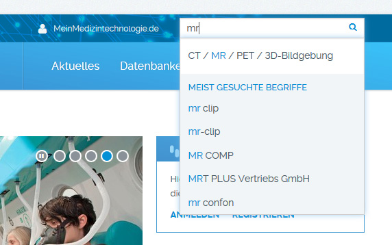
Auto-suggest search field with our predefined tags

Under every article you can find other references to our content
All these above described developments engaged us completely. We started with this state of development in April 2014 and launched the platform. We also had to commit to ourselves that the medical product development guide needed more resources and we decided to publish it later in November 2014. My next article will be dedicated to this development process of the medical product development guide. So stay tuned!